How to make a responsive website design?

In today's world, cell phones have become an integral part of our lives. Everything around us has various gadgets, and fast internet access has become extremely important. Creating a responsive design for a website has become a critical task for any business that wants to attract the attention of online visitors and keep them on their resources. Our team, with experience and innovative solutions, is ready to provide a simple look at creating an adaptive design, telling you about best practices and exciting facts.
Why is adaptability so important?
Adaptive design is not just a trend but an integral part of the user experience. Mobile device users are growing yearly, and a lack of adaptability can alienate a significant portion of your audience. Remember, satisfied users are crucial to increasing conversions and strengthening your brand.
1. Principles of Adaptive Design
Flexibility and proportion
Adaptive design should be flexible and proportional. Instead of fixed pixels, it is preferable to use percentages or em. For example, setting the width of a block to 100% will automatically allow it to stretch or shrink depending on the screen size.
Creating flexible grids will help distribute content evenly across devices. Use CSS Grid or Flexbox to create a grid that easily adapts to different screen sizes.
Media requests
Media queries are a powerful tool for creating adaptability. They allow you to define styles for different devices depending on their characteristics, such as screen width. This approach allows you to optimize content for each device.
Images and videos
Optimizing images and videos for different screen resolutions is integral to responsive design. Use different versions of images and videos for mobile and desktop devices to speed up loading and improve site performance.
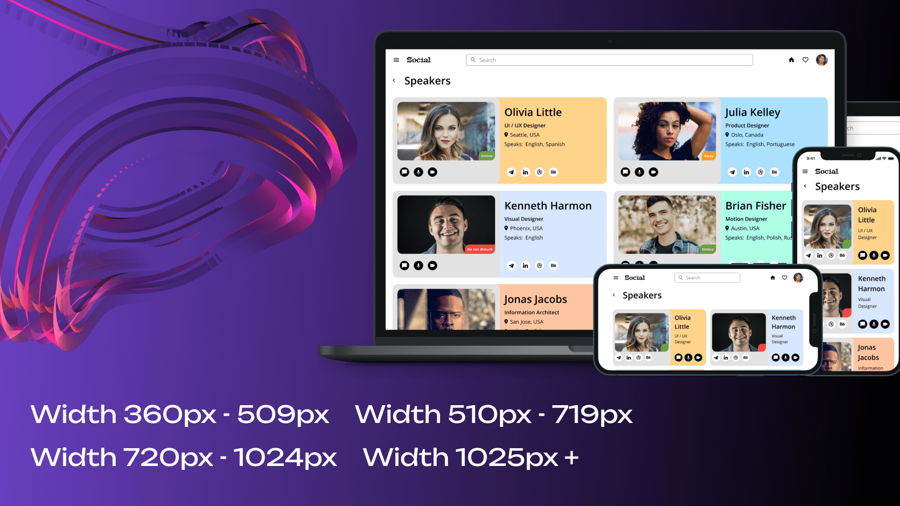
Testing on different devices
You can regularly test your website on various devices, from cell phones to desktops. This will help identify and fix possible display problems.
2. Mobile first!
According to statistics, more than half of internet users prefer mobile devices to access websites. Therefore, start designing with a mobile version and then scale up to desktop screens. This method ensures your website looks and functions perfectly, even on the smallest screens.

3. Interesting facts about adaptive design
Google и SEO
If adapted for mobile devices, Google recognizes responsive design as a best practice and can boost your site's ranking in search results.
Speed and attention retention
According to research, if a page takes more than three seconds to load, more than half of users will leave the site. Adaptive design reduces load time and increases the likelihood of visitor retention.
Global trends
Many big brands are moving to responsive design, prioritizing versatility and a better user experience.
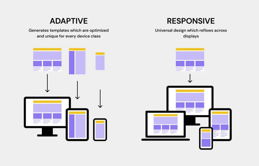
4. Responsive vs. Adaptive Design: Differences and Advantages
Responsive design
Responsive design involves creating one website version that automatically adapts to different devices. It uses flexible grids and media queries to optimize the display of content. While this approach provides ease of content management, resources and development time can be more demanding.
Adaptive design
Adaptive design is a more flexible strategy that allows you to create different website versions for other devices. Each version is optimized for a specific class of devices, providing an optimal visual and functional experience. This method allows for a more thorough approach to the needs of particular devices.
5. For whom is an adaptive solution suitable?
Desktop-oriented websites
Adaptive design is excellent for sites that are originally desktop-oriented but must be updated for mobile devices to improve search engine visibility. It effectively restores visual presentation and functionality without losing key information.
Limited budgets
For creating new sites, first customized for desktop, with limited financial resources, adaptive design provides a more budget-friendly solution. This approach allows you to implement changes in stages, starting with the main focus.
Focus on text and photos
Adaptive design is especially effective for resources where the main content consists of texts and photos. By carefully optimizing and adapting these elements for different screens, you will achieve maximum readability and visual impact on different devices.
A combination of responsive and adaptive design can provide the optimal solution for the diverse needs of your business. The unique benefits of each method can be implemented with the specifics of your web project in mind. Our experts at UST are ready to help you determine the best approach and create a website that effectively engages with your target audience, regardless of the device they are using.

